

Create Red Block Button
May 21, 2020
In this chapter we will build out our button components that we will be using through out the application. First lets go ahead and create a Primary button.
In the components folder create a folder called buttons. Then create a RedBlockButton.vue component and add the following:
<template>
  <button
    @click="handleClick"
    class="cursor-pointer bg-white border
    border-red-light text-red-darkest focus:outline-none
    font-display rounded-px px-16 py-2 hover:bg-transparent
    hover:border hover:border-red-darkest"
  >
    <div v-if="isLoading">
      <img
        aria-label="loading-spinner"
        class="spinner"
        src="../../assets/loop.svg"
      />
    </div>
    <div v-else>
      <slot></slot>
    </div>
  </button>
</template>
<script>
export default {
  name: "RedOutlineButton",
  props: {
    isLoading: Boolean,
  },
  methods: {
    handleClick(evt) {
      this.$emit("click", evt);
    },
  },
};
</script>
<style>
.spinner {
  display: inline-block;
  animation: rotate 2s infinite linear;
}
@keyframes rotate {
  from {
    transform: rotate(0deg);
  }
  to {
    transform: rotate(360deg);
  }
}
</style>
🧁In the template part we have a button with a handle click event.
🧁 Then if the v-if statement is triggered the isLoading prop is set to true. It will show the loading spinner.
🧁 We have a method that emits a click event.
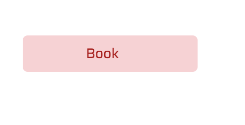
Once you're done it should look like this:
 Previous
