

Create Red Outline Button
May 18, 2020
In this chapter we will build out our Secondary button.
In the buttons directroy create a RedOutlineButton.vue component and add the following:
<template>
  <button
    @click="handleClick"
    class="cursor-pointer bg-white border
    border-red-light text-red-darkest focus:outline-none
    font-display rounded-px px-16 py-2 hover:bg-transparent
    hover:border hover:border-red-darkest"
  >
    <div v-if="isLoading">
      <img
        aria-label="loading-spinner"
        class="spinner"
        src="../../assets/loop.svg"
      />
    </div>
    <div v-else>
      <slot></slot>
    </div>
  </button>
</template>
<script>
export default {
  name: "RedOutlineButton",
  props: {
    isLoading: Boolean,
  },
  methods: {
    handleClick(evt) {
      this.$emit("click", evt);
    },
  },
};
</script>
<style>
.spinner {
  display: inline-block;
  animation: rotate 2s infinite linear;
}
@keyframes rotate {
  from {
    transform: rotate(0deg);
  }
  to {
    transform: rotate(360deg);
  }
}
</style>
🧁In the template part we have a button with a handle click event.
🧁 Then if the v-if statement is triggered the isLoading prop is set to true. It will show the loading spinner.
🧁 We have a method that emits a click event.
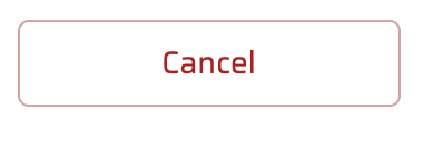
Once you're done it should look like this:
 Previous
