

Create Tour Card
May 21, 2020
In this post we will make a tour card that will allow us to display all our listings.
Create a cards directory and create TourCard.vue file:
<template>
  <div class="rounded-px w-card h-auto shadow-lg-card cursor-pointer">
    <img :src="coverPhoto" class="w-full h-48 rounded-t-px" />
    <div class="flex flex-col p-2">
      <div class="flex flex-row mt-2 ">
        <BodyOne class="text-lg text-black font-display">{{
          listingTitle
        }}</BodyOne>
        <BodyOne class=" text-sm text-grey">{{ listingLocation }}</BodyOne>
      </div>

      <BodyOne class="text-green-dark text-lg mt-8">${{ price }}</BodyOne>
      <a-rate :default-value="rating" disabled />
    </div>
  </div>
</template>
<script>
import Typography from "../typography/";
const { BodyOne } = Typography;
export default {
  name: "ListingCard",
  components: {
    BodyOne,
  },
  props: {
    listingTitle: String,
    listingLocation: String,
    price: String,
    rating: Number,
    coverPhoto: String,
  },
};
</script>
🔇 Here we have a div that is styled accordingly to look like a card, which will accept props.
🔇 It also uses Ant Design's <Rate/> component so we can display the rating of the listing.
Next off we need to add Ant Design because we will use it's tabs and rating components.
$ yarn add ant-design-vueThen next head over to the main.js file to register it globally:
import { Tabs, Rate } from "ant-design-vue"
import "ant-design-vue/dist/antd.css"
Vue.use(Tabs)
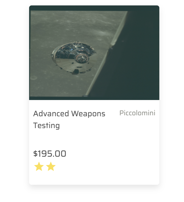
Vue.use(Rate)Once you're done, it will look like this:
 Previous
